Challenge
A producer of shocking short films and music videos sought a cutting-edge brand to attract talented directors and stand out from competitors.
Approach
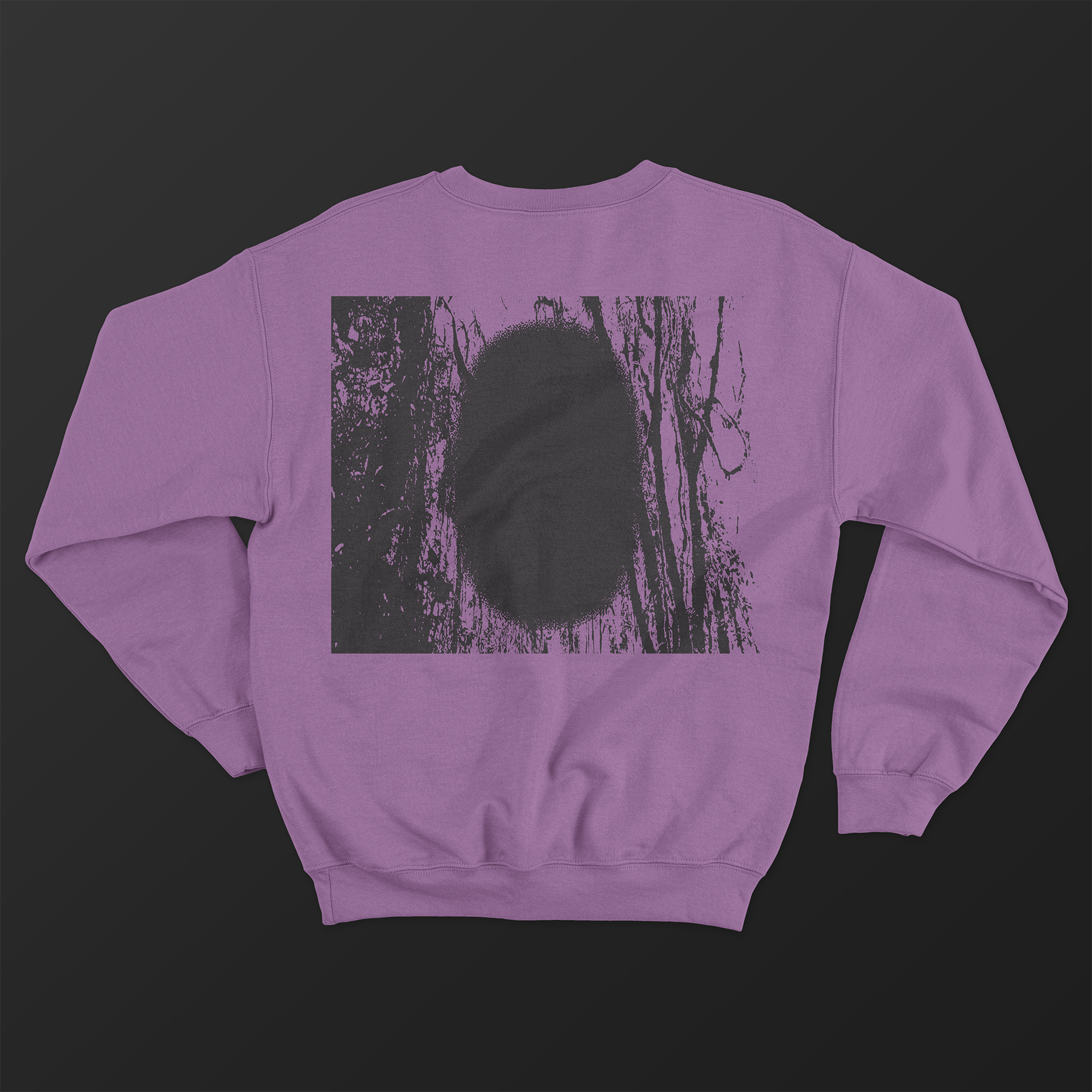
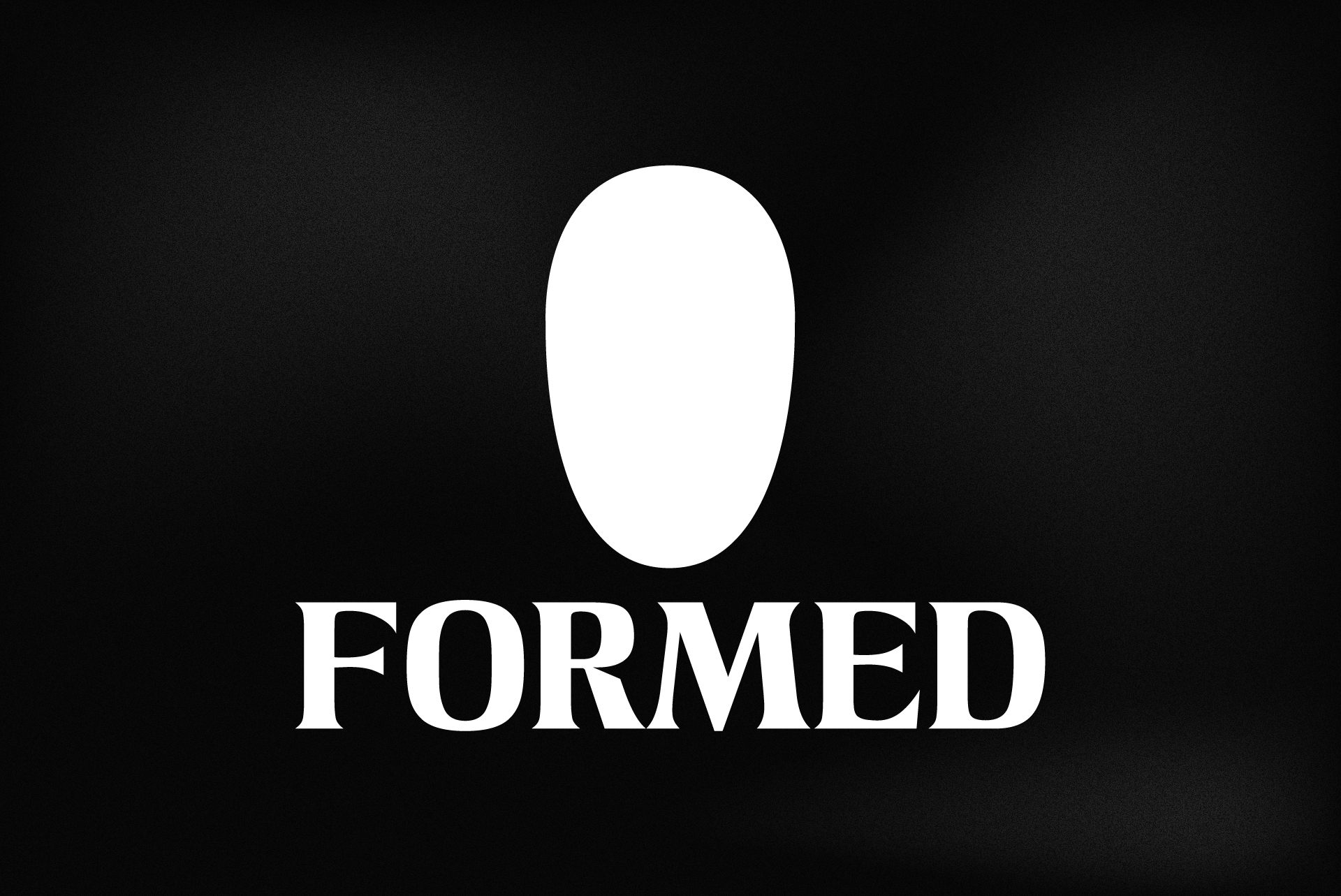
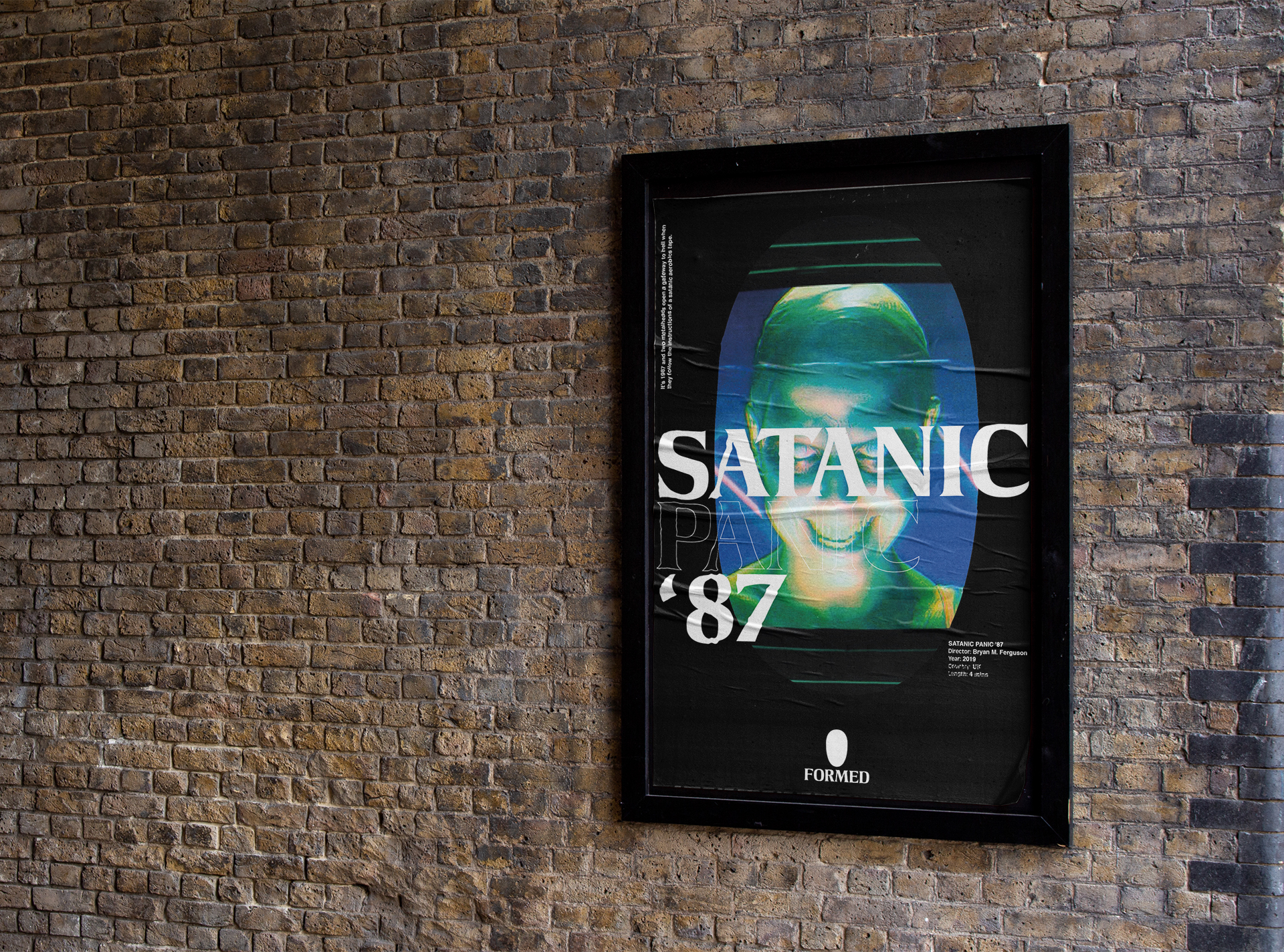
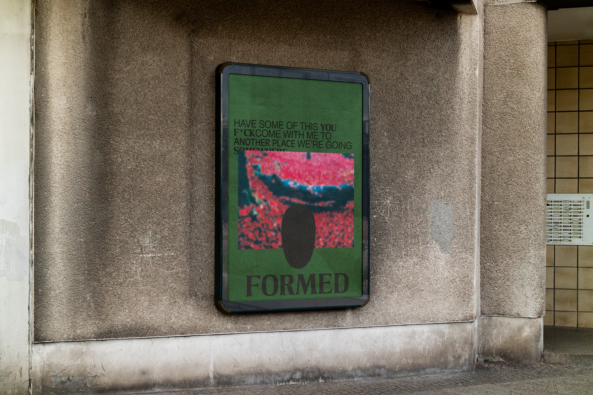
Through research and analysis, we developed various insights and concepts aligning with the theme’s in Formed’s far-out productions. We developed a logo using a portal concept, representing the creation of alternate realities. The form inspired by the open mouth’s in Francis Bacon paintings.
Outcome:
The brand evoked pulp-horror aesthetics and alluding to the company’s unique output. We provided comprehensive brand guidelines and assets ready for launch.