Challenge
Pete, a freelance editor, needed to create a distinct brand identity for his growing company, one that would resonate with innovative and boundary-pushing creatives, build trust with bigger budget clients, and convey a playful yet unquestionably trustworthy tone.

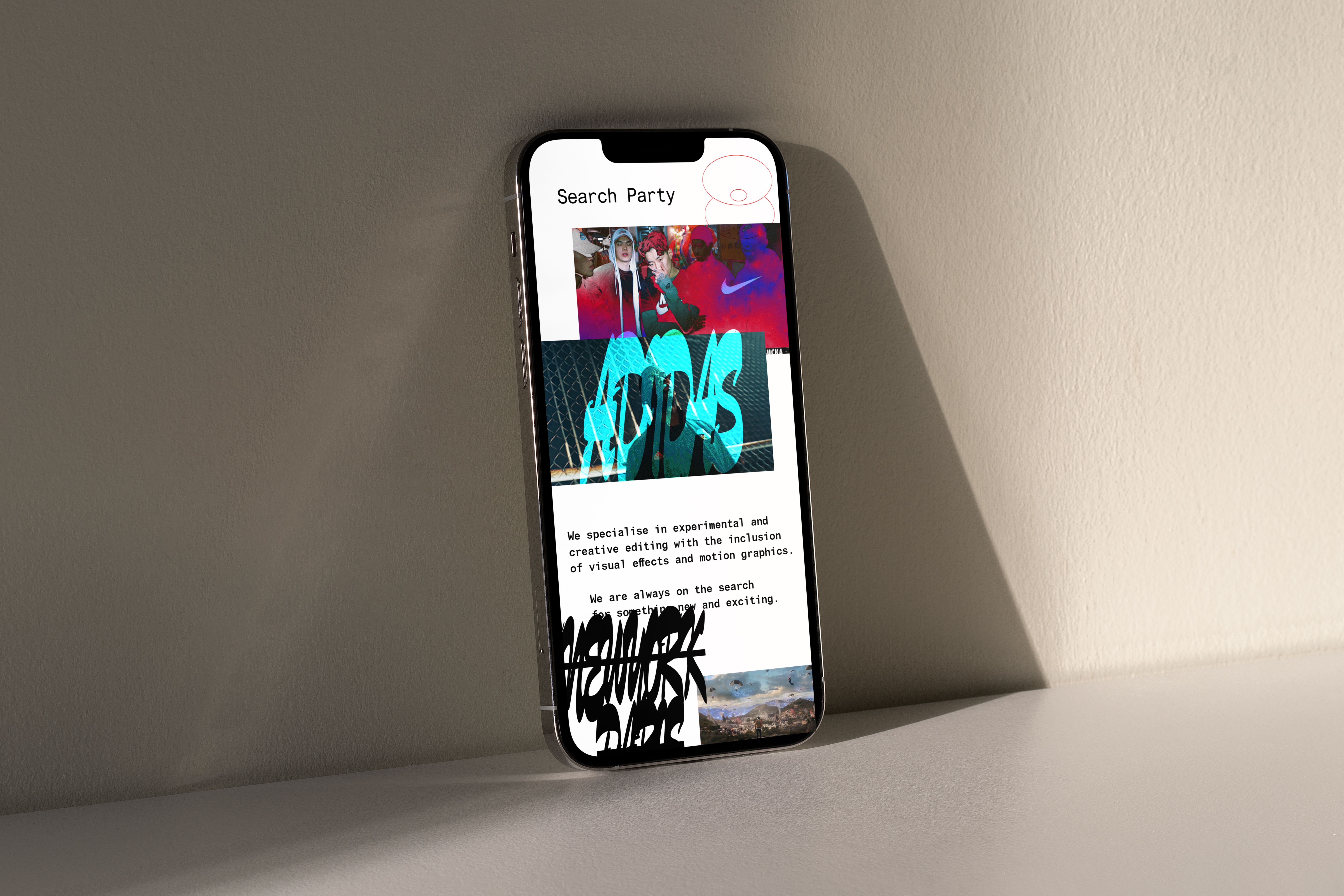
Approach
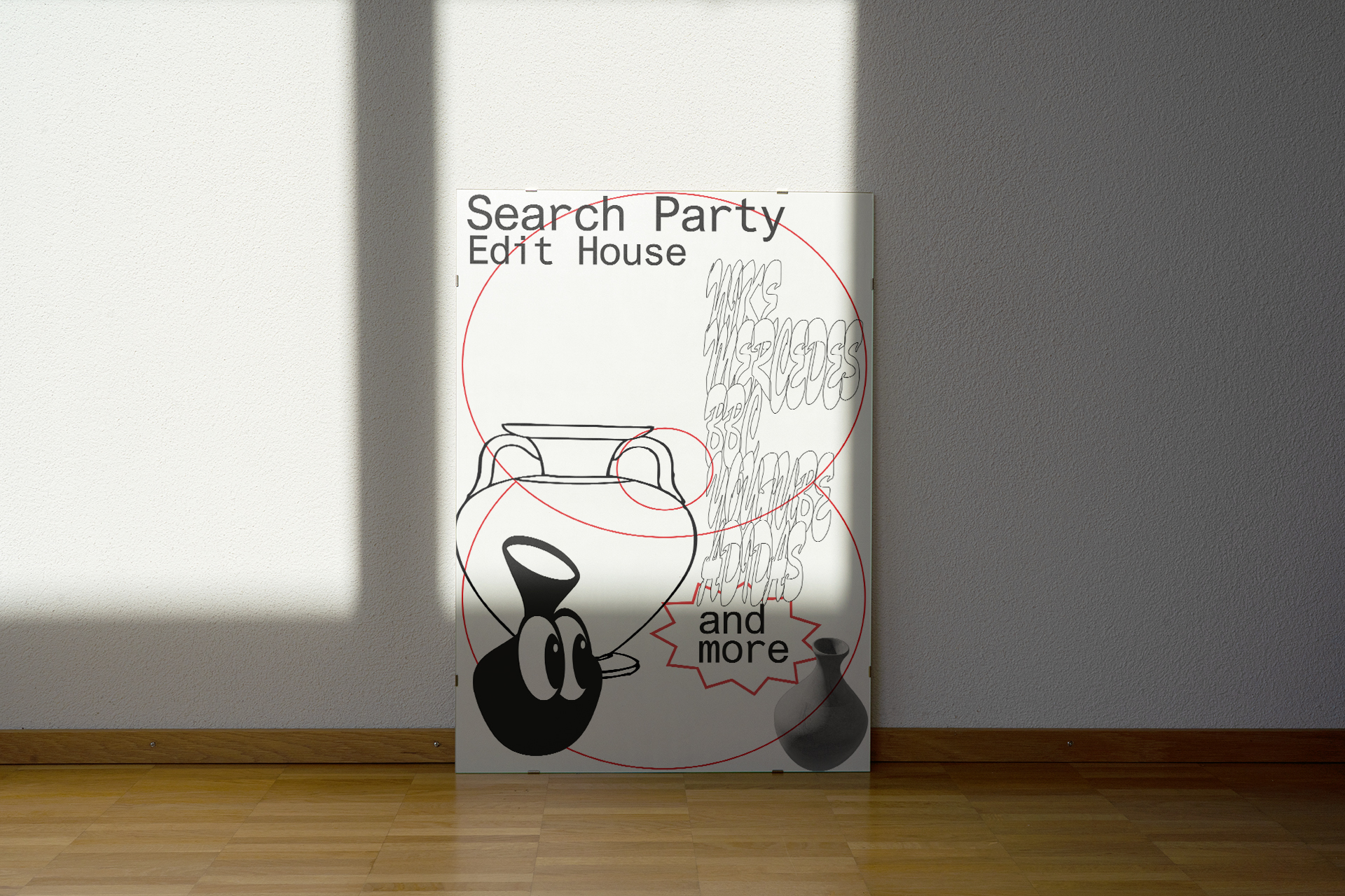
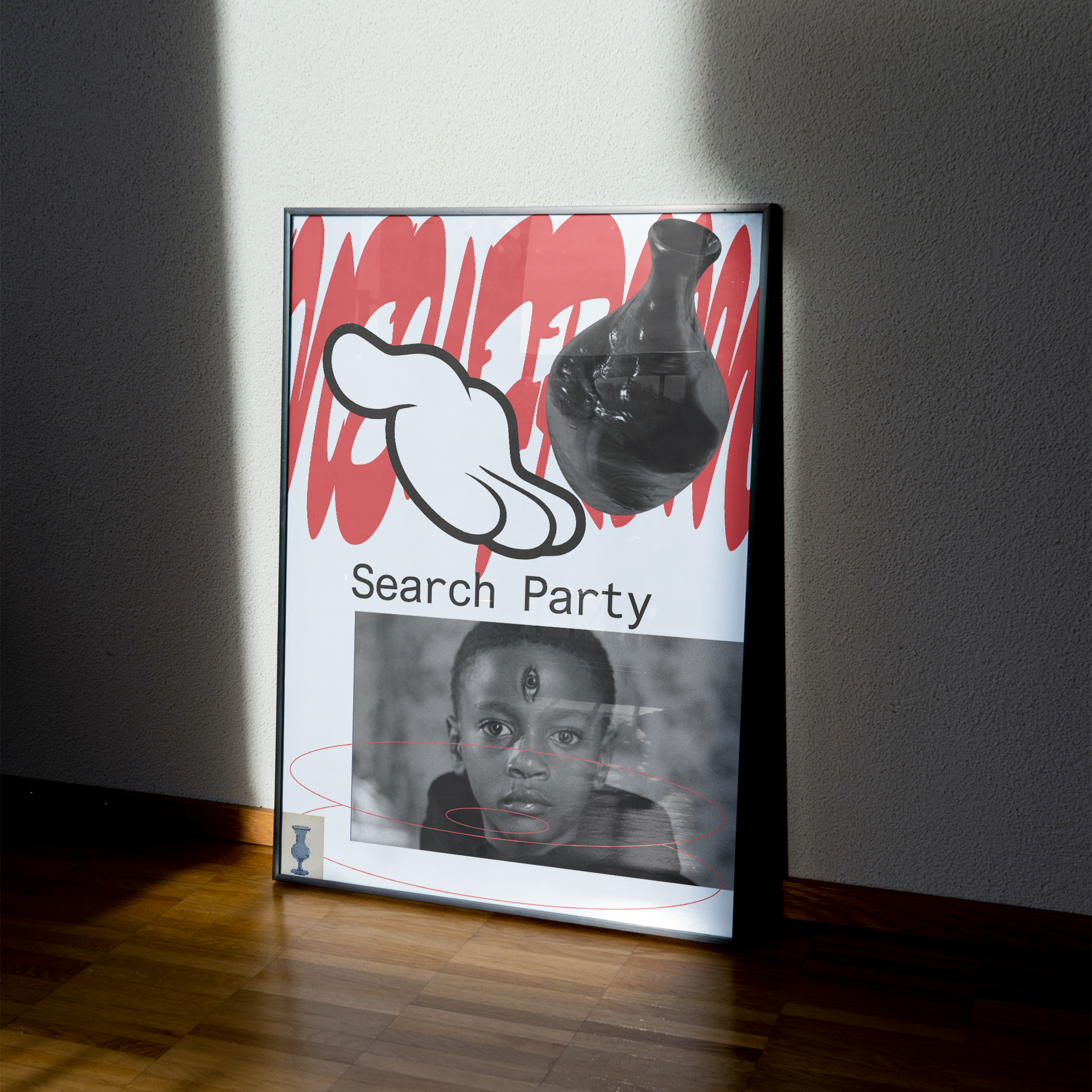
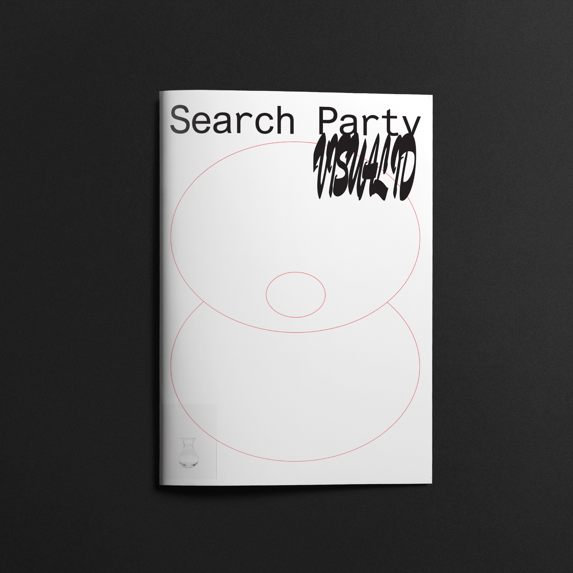
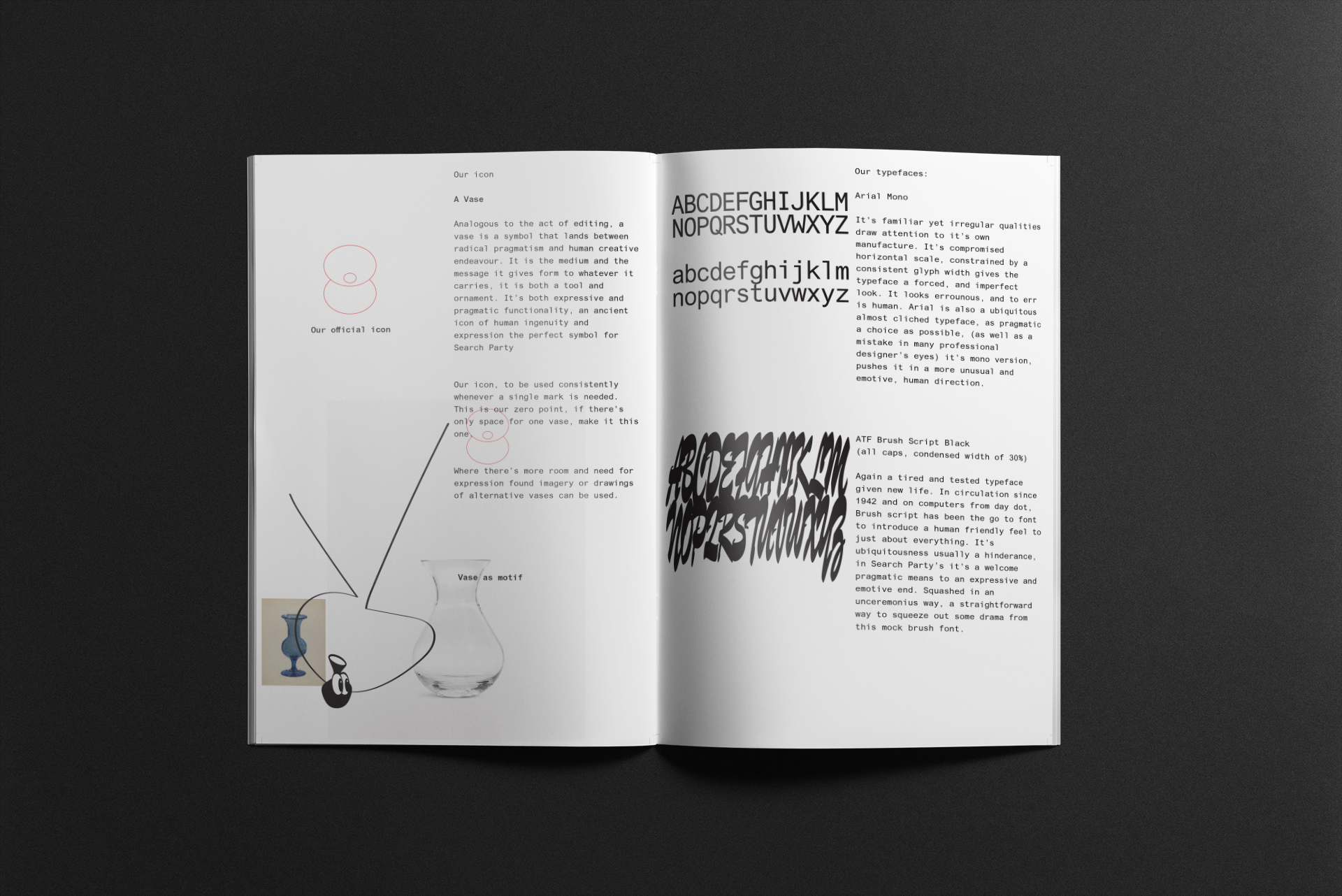
Through brand strategy, we defined Pete’s core message as “Explore, deliver, delight” and used it as the blueprint for his verbal and visual communication. After exploring numerous name options, Pete settled on “Search Party,” which was then visually represented by a vase logo, breaking away from typical editing company tropes.
Yeah been getting such great feedback on it, people love it. And it’s the right people that are getting in touch to say that. Thanks again man!
Pete Fullarton, founder of Search Party
Outcome:
The brand “Search Party” successfully aligned with Pete’s target audience, reflecting his values and authenticity. It provided a flexible and versatile identity that could be applied across various platforms, maintaining a cohesive and consistent image for the company.